

A social journal for travelersFrom ideation to user testing
WORK
A social journal for travelers: from research to user testing with prototype
MY ROLE
- UX Researcher
- UX Designer
- UI Designer
WHAT IT WAS ALL ABOUT
I was asked to detect a design opportunity for an app in the domain of travels
#socialnetwork#web#nativeApps#journal#travel
BRIEF
People may change the way they approach to travel experience. My challenge is to give them the opportunity to plan a travel and visit places around the world from a new perspective with an open mind focused on the travel as an emotional experience through the action of keeping track of their trips in a detailed social journal to share and keep memories while also giving and gaining inspirations and suggestions for more travel experiences.
INSPIRATION
My inspiration comes from a conversation I overheard in a bar.
A group of friends were sitting at a table and they were talking about travel, their travel habits,
their latest trips. Some of them sounded like traveling a lot. They were actually telling about their
latest trips, but I noticed they were just listing those attractions they had visited. Not a word about
the real spirit of those places and the emotions they conveyed. Have they already forgotten about it
or they just were unable to tell or recall as it was?
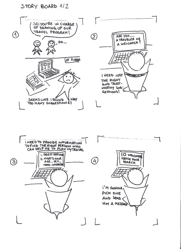
OBSERVATION AND INTERVIEW STAGE
After I got my inspiration, I started "hunting" three persons, perspective users, who could help me in the observation/interview phase. I wrote down all the interesting moments, breakdowns and possible workarounds after each interview. Then, I made a list of the most relevant needs/goals/tasks inspired by all the material collected during this step in my UX process to sum up the main insights.
Interview #1: Lorenzo
- When Lorenzo plans a journey for him and his friends he spends hours browsing for information and suggestions. He needs a way to save time and get well-focused and consistent information about the places he's going to visit.
- Lorenzo needs a way to get suggestions that can be valuable in an objective manner. Suggestions about what to see, and what to do and what to eat during a vacation travel can be misleading when they are provided by tourists from different parts of the globe, with different tastes, education, and culture.
Interview #2: Marzia
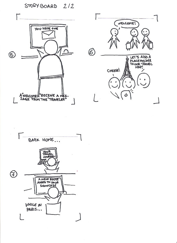
- Marzia can never match her holiday work schedule with the ones of her friends, so she can't find a travel companion. She needs to find a way to enjoy her vacation travel and share her experience with others, even when she leaves alone.
- Marzia is not an ordinary tourist. She can speak three languages and she travels a lot. She needs to get connected to somebody who is willing to enhance her traveling experience.
Interview #3: Fabio
- Fabio needs to find suggestions to travel on a low budget.
- Every time he gets back after his travels, Fabio really sounds like having way too many pictures that end up in some cloud storage, where no one will ever look at them anymore and where they will never be selected and sorted.
- Fabio needs to have some commitment that pushes him to enjoy face-to-face interactions.
THE DESIGN OPPORTUNITY
Making sense of the insights collected
The overall insight I came up with was that tourists should plan their vacation as a compelling experience and get in touch with the local and original spirit, traditions and environment of every place they visit. Human interaction with local people is what can enable everyone to turn from tourists into travelers, right from the planning process, that should be not stressful, straightforward and well focused on user's tastes and wishes.
Definition of Personas and the creation of Journey Maps and Empathy Maps made the whole picture much clearer by stripping down all materials collected.
PROJECT GOALS
When trying to plan a travel, the Internet can be useful, but it often makes users waste a lot of time, providing them with a big amount of information. So it's hard to slim down the list and keep those suggestions for activities that are worth the effort to spend a restless vacation. Travels can turn into something more valuable than being always on the go from one attraction to another, just to say "I've been there". The POV I came up with is that tourists should plan their vacation as a compelling experience, never stressful, but straightforward and well-focused on user's tastes, wishes, and needs. They should be able to get inspiration for their travels from other tourists all year round and, in turn, collect insightful memories while living their travel experience and share them with other travelers right away. The words I came up with that relate to my design idea are relaxing, imagery, getaway, connections, welcome, events, route, traditions, specialty, straightforwardness.
UX CHALLENGES
- The first major UX challenge I came across was to sum up all the insights from my interviewees into a compact concept design, based on their needs but also feasible, not way too ambitious and hard to manage!
- The second major UX challenge was about designing a product that is quick and easy to use while on-the-go, to let users build their trip journal adding some value, because most of them are already busy posting their pics in real-time on Instagram.
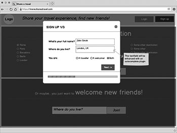
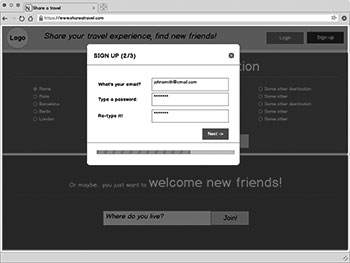
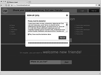
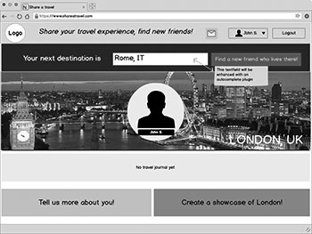
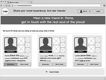
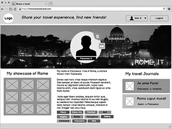
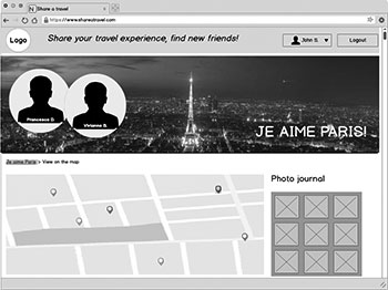
WIREFRAMING
Main features made clear!
This project was quite huge! I started with two versions of a wireframe for the main features. I couldn't make them fully interactive, but the link hints were added to help users navigating the main track during the user testing sessions, just in case they wanted to explore it further and out of the defined tasks to accomplish, that were included in the testing protocol.
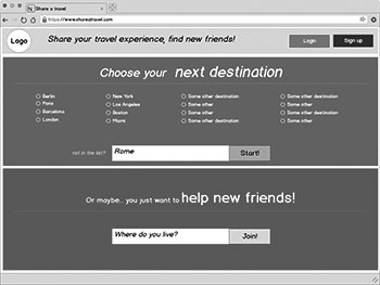
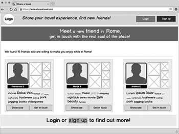
I wrote a heuristic evaluation report for the two wireframes during the first informal testing session. It comprised a list of usability issues that I found in each wireframe, along with their severity rate. Comparative feedback between the two wireframes helped me to choose the variation of the wireframe that seemed to be more effective.
USER TESTING
Test early, test often
After recruiting participants for the first usability testing session of the interactive prototype (both remote and in-person), I wrote the documents needed for this process. They included:
- Informed Consent Form [pdf]
- Pre-test survey [Google Forms]
- Experiment Protocol [pdf]
- Evaluation Plan [pdf]
- Post-test Interview Questionnaire [Google Forms]
pdf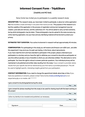
pdf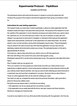
pdf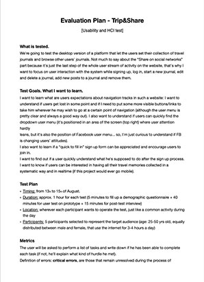
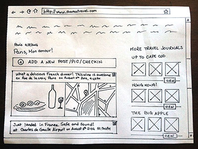
Activity brief from the user-testing session
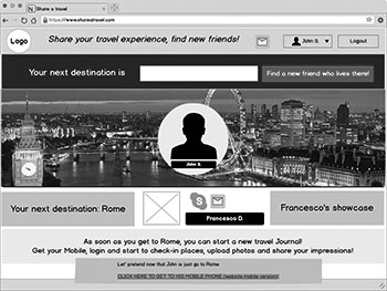
User #1 - Michaela
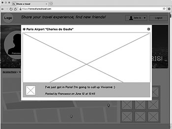
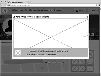
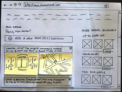
While Michaela was adding a new post to her journal, she was thinking aloud and it sounded like she was a little confused in the process of writing something, adding a pic and pretending to do a check-in (Justinmind didn't let me simulate this functionality). It seemed way too easy to post the new content, just forgetting to write something or to add a photo! This gave me the opportunity to redesign a step-by-step process for adding a new post.
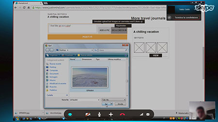
Michaela got a little confused in the process of posting new content
User #2 - Paolo
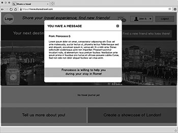
While checking out our ghost user journal, Paolo was moving the mouse pointer around in the page just like he was looking for something. He was expecting to have the chance to add other users' journals to some "My favourite journals" list. Actually this functionality can give users the chance to collect and quickly find other users' journals to get suggestions for their own travels.
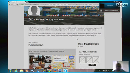
Paolo expected to be able to collect favorite journals in a personal list
User #3 - Francesca
While checking out some journals, Francesca was thinking aloud and was asking to herself what if she wanted to search for some other journal. That's a breakdown: the search-box should be always on top of the page while visiting users' journals.
Francesca was urging to search among journals
Findings
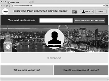
- Users said they were expecting to get more incisive impression at first sight. I should use a more clear and strong call to action in home page.
- Elements in every form don't have full error validation (such as validation for accepted characters, right string format with regular expresson and so on) with specific error feedbacks.
- "Update your information section" contains 3 forms. One is for personal information, the second one is for changing the password and the third one is for deactivating the account. Users focused just on the first one. They might think that there was nothing else after the first submit button and they don't scroll backward futher. So they don't realize that there are two more forms (and functionality) below the first one.
- When forms are too long, the feedback message for error or success falls out of the display area.
- When adding a new journal users was expecting it to show up on home page (but in this prototype the home page is not data-driven, it's just static).
- When adding a new post to a journal users seemed a little confusing about what to do first.. add a photo, or maybe a text first or do a check-in!?
- Users where expecting to have the chance to edit a post or photos.
- Two out of three users asked me to make the other users' journals more useful, adding the chance for each user to collect in a Favourite directory all the journals they liked for future reference.
- When browsing around for other users' journals, my test participants seemed to get confused about how to go somewhere else without going back to the homepage first. On journals there are no breadcrumbs, and I should give the user the chance to go on in navigation in a fluid way.
- After the log in, a user made me notice that the sign up button should not be visible until logout.
PAPER-PROTOTYPING REDESIGN
Improvements from the first iteration
List of changes
- I'll redesign the visual part of the prototype using new fonts and powerful colors to give the application personality and make the user experience enjoyable.
- I'm going to make the purpose of this application more straightforward, with a stronger call to action, adding the "Start a new journal" button right on the home page.
- I need to add a full error validation with specific error feedbacks to all elements in every form.
- I need to redesign the "Update your information section" so that the user can perceive the presence of those three forms, for personal information, for changing the password and for deactivating the account. I may add a three-tab panel.
- I need to add a "scroll to anchor" action on post, when forms are too long and the feedback message for error or success falls out of the display area.
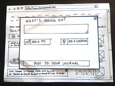
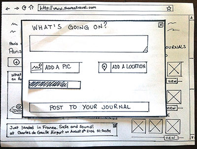
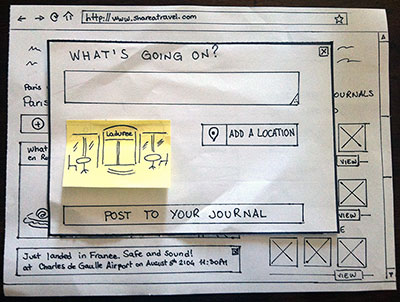
- When adding a new post to a journal users seemed a little confusing about what to do as a first step: add a photo, or maybe some text first or maybe do a check-in. This gave me the opportunity to redesign a step-by-step process for adding a new post (see paper-mockup).
- Users where expecting to have the chance to edit a published post or manage the uploaded photos. Actually I didn't want them to edit because in real life you should not ever re-edit a memory, but users mental models may be different from mine. So, I'll add a "Edit a post" function
- I'll add, on journals, a button to let each user add it to his Favourite journals directory and check it out or use it for suggestions for their own travels, later on.
- I'll place a search-box always on top of the page for users to find it quickly, while viewing journals.

ITERATIVE USER TESTING
Activity brief
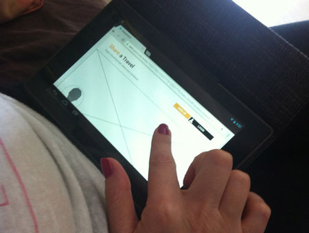
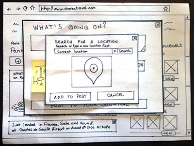
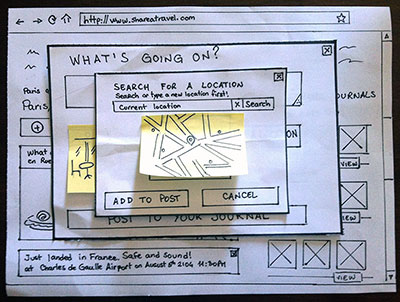
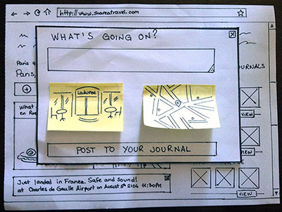
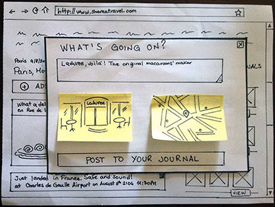
I've made an alternative paper-based design for "add a new post to journal" functionality:
- click on "Add a new post/pic/check-in",
- click on "Add a pic" in the modal window,
- browse and pick a photo,
- wait for the photo to be loaded in the modal window,
- the photo shows up in the modal window. Now click on "Add a location",
- type a location and search on map or just search for the current location,
- the map with the placeholder shows up,
- write something about what's going on,
- the new post shows up in your journal.

 This website uses exclusively technical cookies